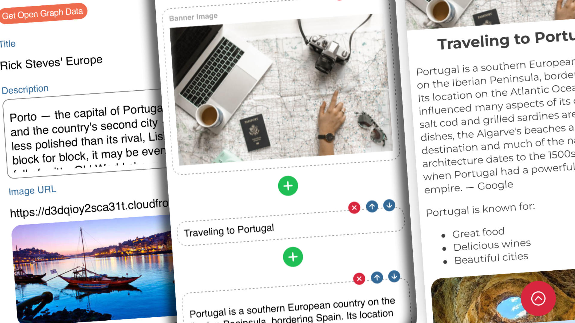
If you've ever had to create web content specifically for mobile devices you'll know that it can be challenging. Even more so if you then want to share that content, easily. While there are many options and platforms from which to choose from, they sometimes seem overly complicated. Spryly's Story Cards solve that problem!
Not only are Story Cards easy to create, but since they're part of Spryly they automatically have a QR code assigned to them which can be displayed from your own phone or printed and shown anywhere, anytime.
Story Cards are a new type of card within Spryly, for those users with the upgraded PRO plan, and allow you to create and structure your content any way you desire, using a number of components. They can be used for long-form content such as a restaurant menu, a for-sale notice for a car or boat, or to describe and host events.
Currently there are components for:
- banner images,
- titles,
- subtitles,
- paragraphs (containing Markdown),
- photos,
- video (YouTube or Vimeo), events,
- web-links and
- links to MyQRCard contact cards
Additional components are being developed and will be deployed soon.
Spryly Story Cards are also remarkably easy to edit and when saved instantly change the content that people see visiting your card.
Creating a Spryly Story
Creating your first Story card is easy. It begins the same way you create other cards within the platform. Pressing the plus (+) icon at the top of the screen when viewing your cards in the dashboard will reveal the new card wizard.
From that screen, just select the option labeled Story Card. A new Story Card will be created and will be displayed. It will look similar to what a new contact card looks like except that it won’t have the round profile picture component. Only a randomly selected background photo will be shown.
Adding your first component
Start by editing the card. You can do that by pressing the action button in the lower right-hand corner, or the options button (three vertically stacked dots) in the upper right-hand corner, and then selecting Edit Card. This will bring you to the Story Card editor where you’ll see the descriptive name for your card, which you should change, and a plus (+) button in the middle of the screen.
- Press the plus (+)
- Select one of the components
- Begin editing
Each component may have a slightly different interface. Photo and video components are, understandably, different from title and paragraph components. Next, we’ll see what it’s like to edit some body copy using the paragraph component.

Editing components
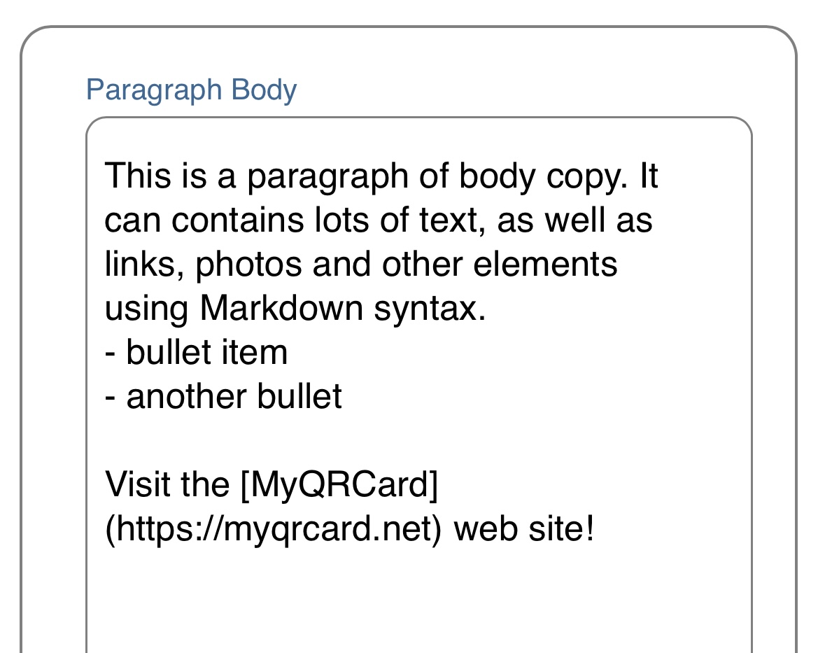
Once you’ve added a new component to a story you can edit it simply by clicking on it. As noted, each component may have a slightly different interface and number of elements associated with it. Editing a paragraph looks like the following image:

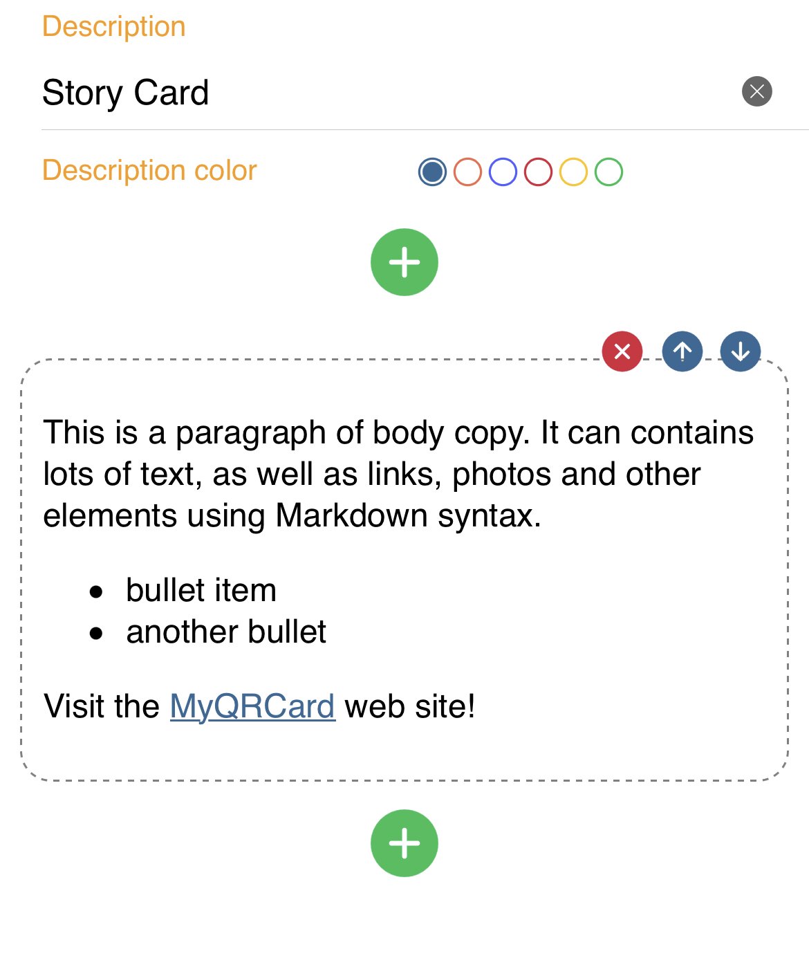
You can see that the interface is a single multi-line editing area where you can add or paste content. Formatting is simple and Markdown syntax is recognized. The example, above, shows some bullet items in a list and a link to an external web site. If you were to press the Save button the component, with edited content, would appear in the story. In the case of the paragraph component the text would appear formatted.

Moving components
Each component appears in the Story in the order in which it will appear when saved. If you would like to move a component up or down within the Story press one of the arrow buttons that appear in the dotted border surrounding the item. Once the Story is saved your components (and content) will appear in whatever order you established during creation and editing.
The one exception to note, though, is that the Banner component can appear anywhere within the Story but will always appear as the top banner image.
Creating an Event
Events are powerful features within Story Cards allowing you to schedule events, similar to what you might do using a platform like Evite. Spryly Events are simple and fast to create, setup and share. Since they’ll likely be an often-used component we’ve created a post specifically for them which you can find here.
Future Components
Plans call for a number of new components to be added in the near future including those for:
- Polls
- Surveys
- Maps
- Photo albums
- Instagram previews
- TikTok previews


